Package-level declarations
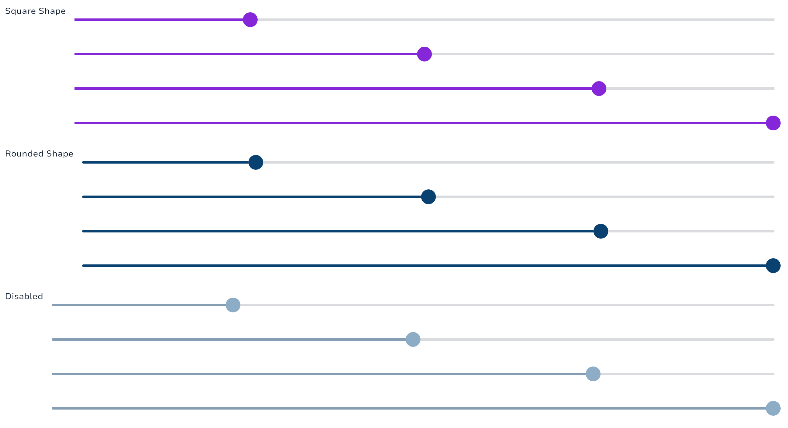
Sliders A slider is an interactive component that allows users to set values by moving a handle within a defined range.
Variants
2 Variants:
Slider
Provides the slider with a minimum and maximum value.
Slider(
    value = 0.5f,
    intent = SliderIntent.Success,
    onValueChange = {},
)| Variants |  |
Range Slider
Provides the slider with a set of two values (range).
RangeSlider(
    value = 0.1f..0.5f,
    intent = SliderIntent.Success,
    onValueChange = {},
)| Variants |  |
Types
SliderIntent is used to define the intent of the sliders.
Functions
Spark Range slider. Range Sliders expand upon Slider using the same concepts but allow the user to select 2 values. The two values are still bounded by the value range but they also cannot cross each other. Use continuous Range Sliders to allow users to make meaningful selections that don’t require a specific values:
Spark slider. Sliders allow users to make selections from a range of values. Sliders reflect a range of values along a bar, from which users may select a single value. They are ideal for adjusting settings such as volume, brightness, or applying image filters.