Package-level declarations
Tabs are used to group different but related content, allowing users to navigate views without leaving the page. They always contain at least two items and one tab is active at a time. Tabs can be used on full page layouts or in components such as modals, cards, or side panels.

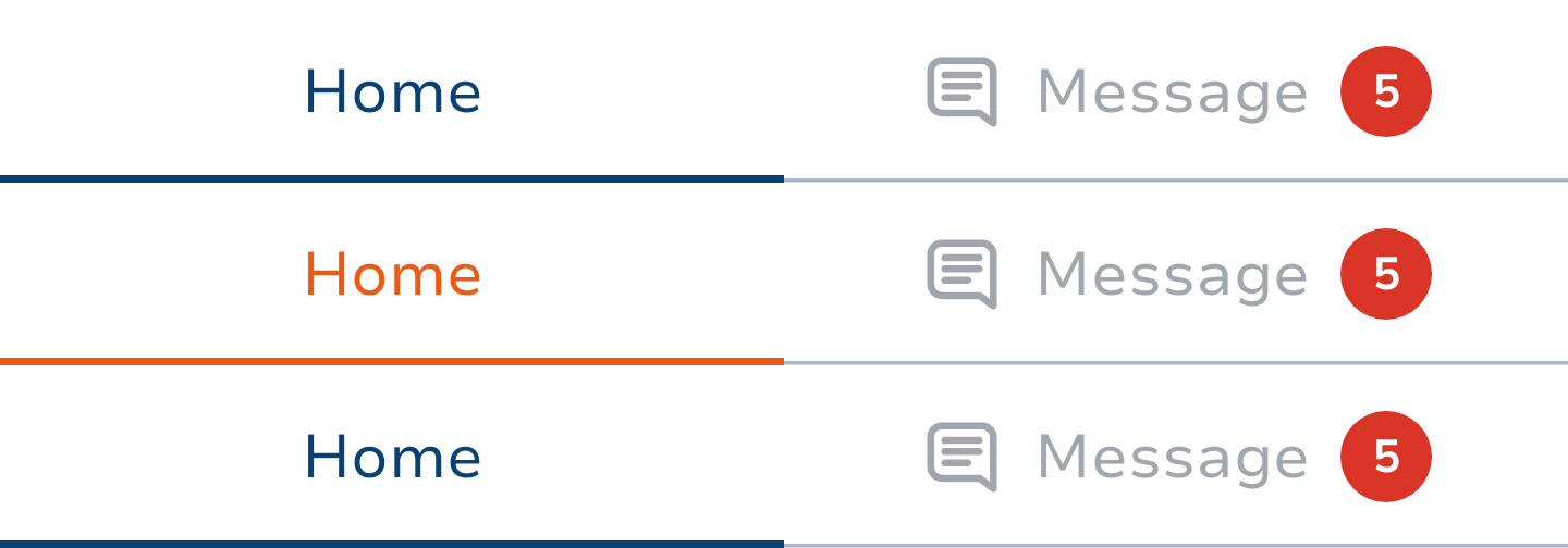
Most commonly chip contains an leadingIcon and/ or the text, but you can also provide a custom trailingContent. It is mandatory to provide contentDescription for icon only tabs.
Styles
The tab can have one of the TabDefaults.kt, that will affect the Tabs typography size:
ExtraSmallSmallMedium(default size)

The size of the icon is the same as the size of the text. For icon-only tabs the icon size is IconSize.Small.
The tabs accept 2 colors TabDefaults.kts:
Basic (default)
Main
Support
 |  |
TabGroup
The tabs occupy just as much space as they need, but they can also be full-width.
Depending on the available place and parameter spacedEvenly, a TabGroup.kt places its tabs evenly spaced along the entire row, with each tab taking up an equal amount of space unless content cannot be fully displayed. In this case each larger tab is attributed a needed space and the rest is distributed evenly among smaller tabs. If there is not enough screen space to display all content, TabGroup will not enforce equal size, and allows scrolling to tabs that do not fit on screen. Each tab will take the needed space ensuring the minimum tab size constraint is met.
Code Samples
To draw tabs
var selectedIndex by remember { mutableIntStateOf(0) }

TabGroup(
    selectedTabIndex = selectedIndex,
    intent = intent,
) {
    tabs.forEachIndexed { index, tab -> // use your tab data
        Tab(
            intent = intent,
            selected = selectedIndex == index,
            onClick = { selectedIndex = index }, // handle click
            enabled = true,
            icon = tab.icon,
            text = tab.text,
            size = TabSize.ExtraSmall,
            trailingContent = {
                Badge(count = tab.unreadCount)
            },
        )
    }
}Types
Functions
Spark tab.